Image optimization for the web
The ultimate guide to image optimization for the web. In this article we show you how to show images to your users as quickly and as nicely as possible. We tell you about the different formats and when you can use them, best practices, plugins and much more. So read on ...
Why do you need to optimize images for the web?
Before you read how you can optimize images for the web, it is useful to know why you would do this. The answer: a better user experience through a much faster loading page and a nicer page thanks to images that look better.
About 25% of the web consists of images. So when you want to start optimizing your page, images are a very good starting point.
The tricky thing about image optimization is finding the right ratio. If your images are too large, then you are slow and Google doesn't like this. If your images are too small, they quickly become ugly and your visitor does not like that. So it's time for the ultimate guide in image optimization for the webb.
Choose the correct format
There are quite a few formats that you can use when you want to put an image online. The important ones are: png, svg, jpg and giff. There are also other formats such as webp and jpeg xr but they are not supported by every browser.
- JPG - JPG is mainly known as a lossy image format. When creating or changing a jpg, information is lost. When saving, you can adjust the quality of the image for the right balance between size and quality.
- PNG - PNG stands for portable network graphic and is intended to be replaced on jpg. PNG save images without losing any information. A PNG is therefore almost always larger than a JPG file.
- GIFF - giff uses only 256 colors and is primarily suitable for creating animated images.
- SVG - SVG stands for scalable vector grapic and has the great advantage that it is always sharp, no matter how far you zoom in, or zoom out on an image. In practice, SVG is often used for logos and icons.
Lossy vs Lossless Optimization
In addition to the different image formats, it is also useful to know that there are 2 types of compression for images. Lossy and losless compression.
Lossy compression loss data during compression. That is not a bug but the power of lossy compression. By combining pixels that look very much like each other, an image becomes much smaller. Almost no one can see the difference between a full uncompressed image and an image with good lossy compression. But beware, if you compress too much and set the quality of an image too low, stripes and blocks can come through the image.
Losless compression is a technique to make an image smaller without losing quality. The disadvantage of losless compression is that an image is always larger than with lossy compression.
Do you value great images? Then you use losless compression. Should an image load quickly and look good enough? Then you can use lossy compression.
Faster image loading for the web
This way you ensure that the images on your webpage are loaded faster.
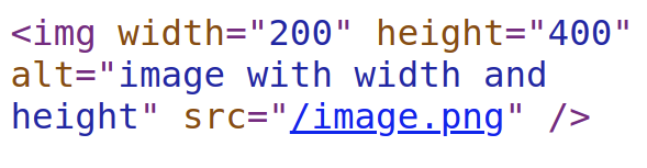
#1 - Image dimensions
Many webmasters forget to give their images a height and width in the html source code (or via CSS). This can result in a considerable delay in loading a webpage. If a browser does not know how much space it needs to reserve for an image, a browser must first download the image and determine its size. An image without width and height then becomes a 'blocking element' that blocks the loading of the page.
#2 - Scale image to correct dimensions
When you take a photo yourself, for example with your new iPhone, the width of your photo is 4000px and the height is 3000px. That is more than 2x as large as your full-HD computer screen. The place you have on a webpage to post a photo is usually a lot smaller. Photos in the text are often no wider than a few hundred pixels to about 1000 pixels wide and a few hundred pixels high for banners.
So it would be a shame to show a much too large photo of a few MBs every time while the browser immediately makes this photo smaller. That could have been much faster.
In the example below, we compare a web-optimized image of 1920x1080 pixels with a scaled image of 223x223 pixels. The file size will be no less than 51 times smaller.
 614kb
614kb
 12kb
12kb
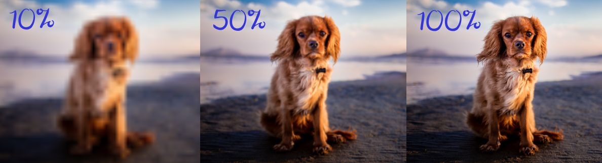
#3 - Compressing images
PG images can be 'compressed'. This means that the file size becomes smaller, but the quality of the image also decreases. The trick is that our eye often does not see the difference between an original and a well-compressed image, while the difference in file size can be huge. Just look at these images
 350kb
350kb
 100kb
100kb
 46kb
46kb
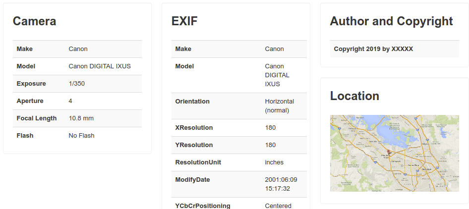
#4 - Remove metadata
Images can sometimes be full of metadata. That is information about the camera, the location, the exposure, the date, etc. All very interesting information for your photo collection so that a smart gallery can sort by date or location. But for the web, it is only superfluous information that is sent again with each image without any benefit to a visitor.
That is why it is best to remove this metadata from an image. You can do this manually, but there are also quite a few tools and plugins that can do this for you. We will come back to that in a moment.
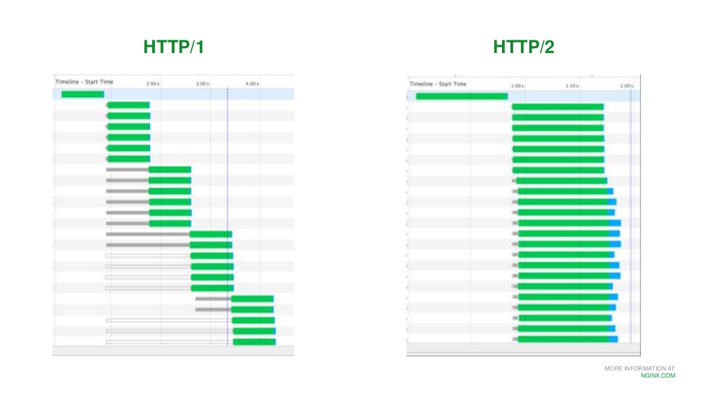
#5 - Http 2/3
Okay, now it's getting a bit more technical. Many websites still use the outdated http1 protocol. This protocol was developed when web pages still consisted mainly of text. Only a limited number of simultaneous connections could be set up, as a result of which images were often loaded one after the other by a browser. The result was the well-known 'staircase' effect. Nowadays it is the http2 (and even the http3) protocol whereby images can be 'pushed' through the same connection much faster. This ensures that pages with many images (or other static elements such as javascript and css) can load many times faster.
Do you want to know if your webpage is suitable for http2? Then have a look at http2.
#6 - Use a CDN?
Maybe you have heard of a CND? CDN stands for content delivery network. This network often has many thousands of servers around the world and uses smart techniques to ensure that your images can be displayed super-fast worldwide. Some CDNs themselves have complete image optimization modules that can take a lot of work off your hands.
A CDN can also have disadvantages, it is more difficult to maintain, you need some specific knowledge and for a single image a CDN is often just a bit slower.
Optimize images for mobile
If you also want to optimize your images for mobile devices, use all the tips above. But with a mobile browser there is something else going on. Namely virtual pixels.
#1 - Images in different formats
While your mobile has a full-HD or even larger screen, your browser uses virtual pixels. For example, a mobile screen pretends to be 600 pixels wide while you secretly have 1200. So you have a pixel density of 2. That means it is possible to display images twice as sharp.
With the srcset attribute you can display different images per screen size. This is often used to choose the sharpest images per virtual pixel density, but you can also do more with them. For example, a mobile phone with a smaller screen can show a smaller or perhaps more zoomed-in image. An image with a src set looks like this:
<img src="image-src.png" srcset="image-1x.png 1x, image-2x.png 2x,image-3x.png 3x, image-4x.png 4x">
The srcset contains 4 different images, the first is for brwosers where 1 css pixel corresponds to 1 real pixel, the second where 1 css pixel corresponds to 2 real pixels (the pixel density is therefore larger and the image can be displayed sharper)).
#2 - Responsive images with CSS
When an image is wider than the number of (virtual) pixels of the device, scroll bars will appear at the bottom of the page. And you can scroll the page from left to right to see the whole image. You must have come across it, it looks a bit crazy.
To counter this, you can apply a very simple CSS trick. That trick ensures that an image is never wider than 100% of the screen (technically from the underlying element).
img:{max-width:100%;height:auto}
In the commonly used and popular bootstrap CSS framework you can do this by giving the class "img-fluid" to an image. The image will never be wider than 100%.
Delay loading of images with lazy loading.
With lazy loading an image is loaded, just before it is visible in a browser. In theory, lazy loading only has advantages. Less data is sent, a webpage loads faster and your website gets less stress.
Until recently you had to implement lazy loading yourself. For example with the wordpress plugin Rocket LAzy Load https://nl.wordpress.org/plugins/rocket-lazy-load/ or with the jQuery JavaSsript lazy http://jquery.eisbehr.de/lazy/. Fortunately that is no longer necessary.
Chrome lazy recently supports loading via the loading attribute. Simply add loading = "lazy" to an image and it will only load just before the image appears.
<img src="afbeelding.jpg" loading="lazy" alt=".."/>
Progressive jpg
Progressive jpg's are another solution to solve the speed problem of images. Normal jpg images are read like a book by a browser. So from start to finish and only at the end can the image be displayed.
Progressive jpg files do this slightly differently. These are already shown as soon as they are loaded a few percent and become sharper during the further loading.
These types of progressive techniques may seem cumbersome but are used by the largest and most successful companies. Facebook, for example, uses this type of technology to quickly display the banner of your Facebook page.
Automatically optimize images
You can easily get a lot of speed gain for your website when you automatically optimize images for the web. This can be done via a web service / API, a plugin or automatically on your own server.
Image optimization services and API's
There are various services that reduce images for you. We compared the losless compression on 10 png images of the top 10 services and sort them by best result (smallest file format, without loss).
#1 - TinyPNG / TinyJPG
In our tests, TinyPNG achieved the highest score with an average compression of 84%. TinyPNG has a free API of up to 100 images per month and a paid version. You can reduce unlimited images via the website. TinyPNG is the only service that also supports animated PNG's.
#2 - Compressio.io
Compressor.io is a completely free web service where you can reduce and optimize unlimited images. There is no payment model behind the website, so there is also no API available. In our test compression.io came in second place with a compression of 79%.
#3 - imgecompressor
Imagecompressor came in third place with a still impressive compression of 73%. Imagecompressor has no API and no payment model but seems to live on Google Adsense.
Image optimization plugins for wordpress
There are a lot of plugins that can optimize images for your wordpress website. most plugins offer a free but limited basic offer. If you want better compression or more images per month then you will have to switch to a paid subscription. Most plugins look at the functionality from each other and offer more or less the same service such as lossy and losless compression, lazy loading, srcsets for mobile devices and retina devices. The 2 most used plugins are:
Automatically optimize images yourself
Ben je een beetje thuis in een LINUX omgeving? Dan optimaliseer je afbeeldingen natuurlijk gewoon zelf. Dit doe je met tools als:
- pngquant for lossy PNG optimization
- OptiPNG for losless PNG optimization
- JpegOptim for JPG compression based on maximum quality
- Gifsicle for gifs
- Scour to reduce SVGs by removing all metadata and improving notation
Best practices
Here you will find general best practice rules when it comes to optimizing images for the web..
- Always specify the width and height of an image. This ensures that a browser does not have to wait.
- Scale images to the size on the site.
- Use CSS3 effects where possible. Does your image have borders, white borders, rounded corners etc? Then you better use CSS3 effects for that. This saves time, file size and is easy to adjust later.
- Automate the reduction of images. Use a good plugin or a server side technique.
- Use lossy compression instead of losless compression because lossy compression gives much smaller images.
- Use jpeg for photos and screenshots
- Use png when you want better details
- use svg wherever possible because they are sharp in every resolution
- Do your visitors come from multiple countries or do you use a lot of images? Then consider using a CDN
- Use load = "lazy" for a faster page display
Technical seo
a/b testing
Above the fold
Alt-tag
Anchor text
Black hat seo
Bounce rate
Broken links
Canonical tag
Cloaking
Content farm
Crawler
Duplicate content
Structured data
Google algorithm
Google Panda
Google penalty
Google penguin
Googlebot
Crawler Traps
Advanced Search operators
Inernal nofollow
Ranking Signal correlation
Google BERT
Linkuilding
Social Media
Website speed
Time to first byte
First Contentful Paint
Inline CSS
Defer JavaScript
Largest Contentful Paint
Resources
Smart WebFont loading for better performance
Icon fonts lazy loading
Improve page rendering with content-visibility
Analytics without Core Web Vitals delay
Self host Google fonts tutorial